
Compass App
Design concept for Vancouver TransLink’s future mobile experience.

Type:
Timeline:
Independent UX Design Project
May 2023, 3 weeks
Scope:
Tools:
User Research + Interviews
User Flows + Journeys
Wireframing + Rapid Prototyping
A/B Testing
Usability Testing
Figma
Maze
Notion
Overview
The Compass Card is a rechargeable physical card used to pay transit fares across the Metro Vancouver public transportation system (TransLink). An online petition in the summer of 2022 picked up media attention as local community demanded TransLink to allow users to add the Compass Card to digital wallets. Unfortunately, this feature will await TransLink’s system updates which could take a couple years to implement according to their statement. As technology advances and our interactions with daily services like public transportation become more integrated with digital touchpoints, I saw an opportunity to use this UX case study as a design inquiry into the future mobile experience of the Compass Card.
DESIGNING FOR GREATER GOOD
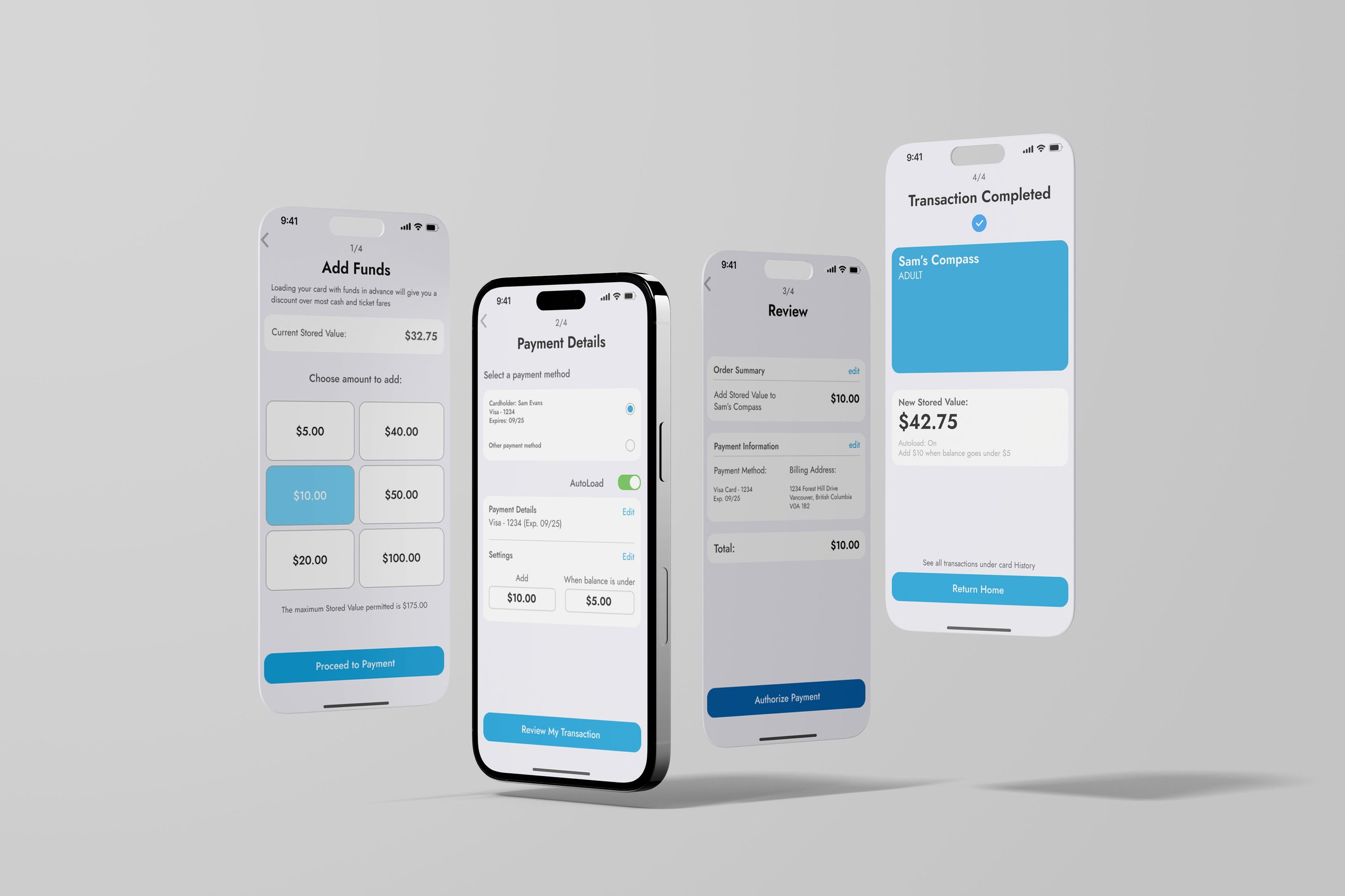
One of the guiding personal questions I challenged myself with was: how can we design an experience that promotes greater public transportation ridership? Design when done well has the power to shape our daily lives and facilitate larger societal initiatives such as environmental sustainability. Emerging research has also shown the implications that accessibility of public transportation has on our physical and social well-being. With this consideration and other user research in mind, I designed the following solutions:
streamlined fare gate experience with lockscreen route navigation functionality
centralized management of Compass Card fares, passes, and programs
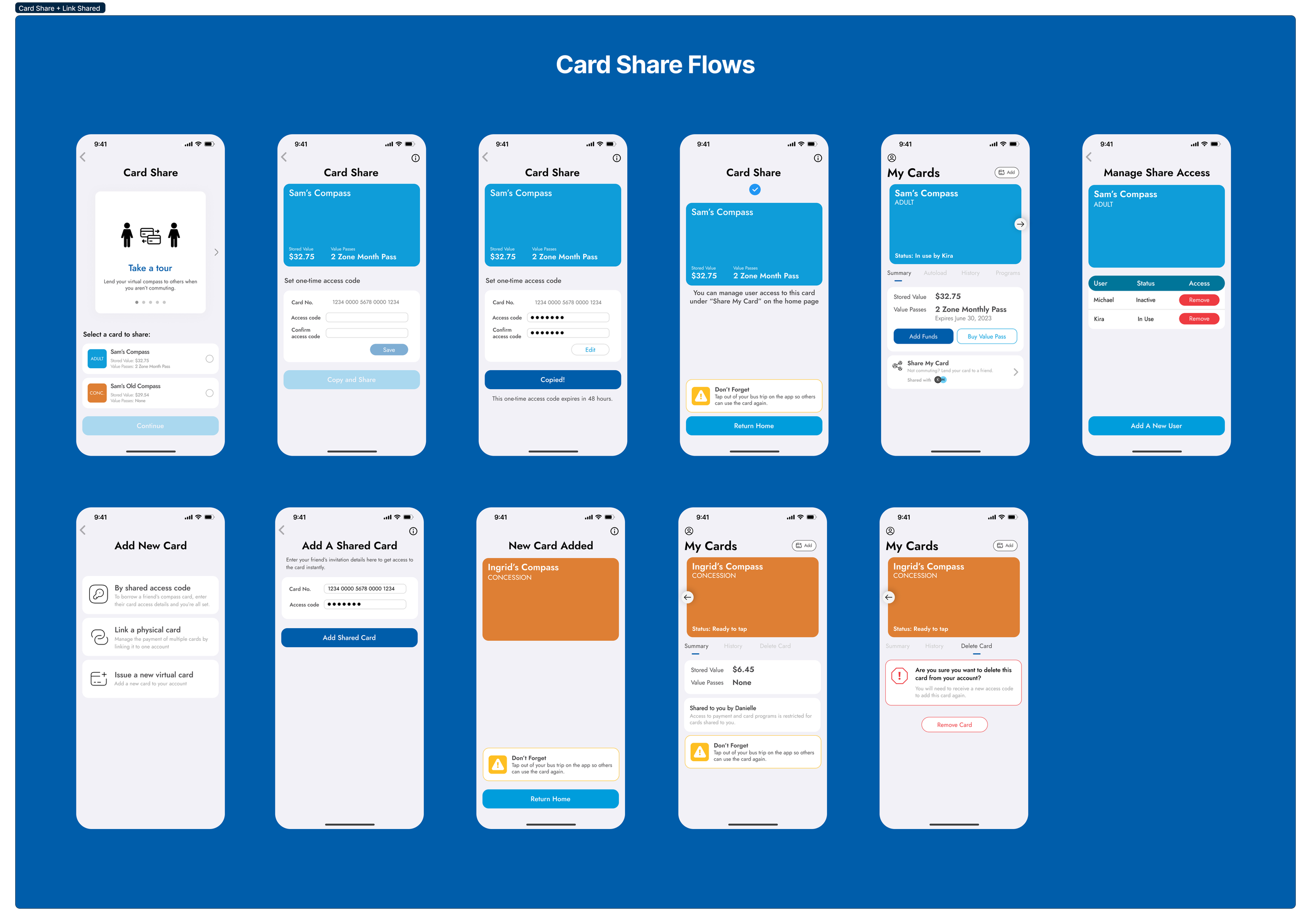
new card share feature to increase incentive for public commuting
1. Problem Discovery
BACKGROUND
Unlike typical things we store on the Apple Wallet like concert tickets, membership cards, and credit cards, the Compass Card provides several functions to serve a variety of use scenarios. A large portion of the user base are university students enrolled in the U-Pass program during the academic year and need to request their U-Pass manually each month. Some users rely on TransLink bike parkades to aid in their regular commute.
The mobile experience should also address the needs of visiting tourists that will require a designated onboarding process to introduce them to TransLink’s fare system and transit zones. Currently, Compass Cards are available for a $6 deposit fee at various retailers across the lower mainland. Users have the option to pay their fares with mobile credit cards or cash, but get charged more hence the current campaign to implement the Compass Card in digital wallets.
USER RESEARCH + INSIGHTS
Since I was operating on a shorter timeline, I focused on tapping into existing user research resources such as online forums specific to Vancouver and the TransLink petition discussion section to form a picture of the key pain points. The benefit of this design challenge and research method was that my target end users were already clearly identified and I had access to a large amount of qualitative feedback directly from them. I didn’t have to invest as much energy in performing user outreach to gather my data. Here were a few of the key insights I found.
-
Several users mentioned accidentally leaving their card at home or work. This ends up not being very cost-effective as they end up having to paying extra fare to go home and back to work the next day to pick up their card. Others brought up the pain point of the $6 deposit fee for physical cards that could be easily lost and need to be re-purchased. The cards are only available at physical retailers which is not very convenient.
-
Users expressed a major frustration with the inconvenience of having to rummage through their bag for a physical card every single time they have to tap in. Another user explains that due to their visual impairment, being able to tap in via the digital wallet on their apple watch makes it a lot easier at the gate.
-
“It’s quite annoying whenever I lend the card to a family member but also need to use it after work,“ one user says. Many of my personal friends I spoke to have also indicated experiences borrowing a compass card from others.
MARKET RESEARCH
Users that had visited San Francisco for travel indicated they liked how easy it was to get the Clipper Card in the Apple Wallet without any apps. Another user pointed out that Japan’s Pasmo/Suica system already allows for reloading and balance viewing within the Apple Wallet. As of right now, no other Canadian cities have transit payment options directly integrated with Apple Wallet, while American cities do. It appears to be a mix of technological and budgetary constraints that hinder the TransLink user experience, which hopefully can be overcome in a few more years so that Vancouver can keep up with other cities around the world.
THE DESIGN CHALLENGE
With so many possible use cases, it was important to prioritize the critical user flows that impact the most consistent transit users. Since this project was building the app from scratch, aligning on the features of the minimum viable product was crucial.
“I often find myself running on a low balance and would love to be able to add money to it on the go. Logging into the website isn’t very convenient and I’m not often by a skytrain to load it at the machine” - TransLink User
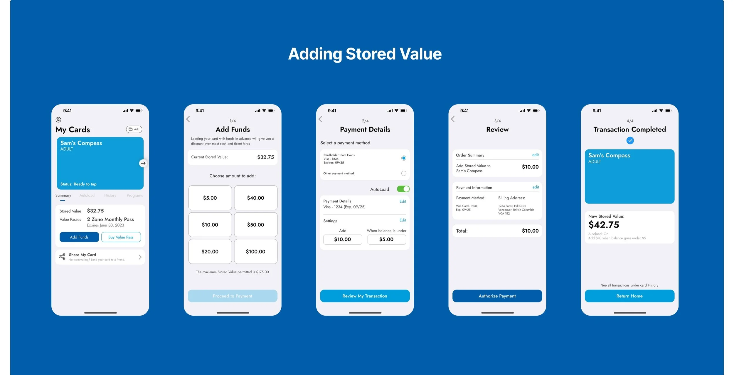
I decided to focus my designs on the frequent TransLink user who already has an existing Compass Card account, is familiar with the fare system/programs, and wants a product that they can rely on to enhance their daily commute experience. Aside from the actual tap in interaction, fare loading functionality would be the next major priority for this app.
2. Design Ideation
KEY USER FLOWS:
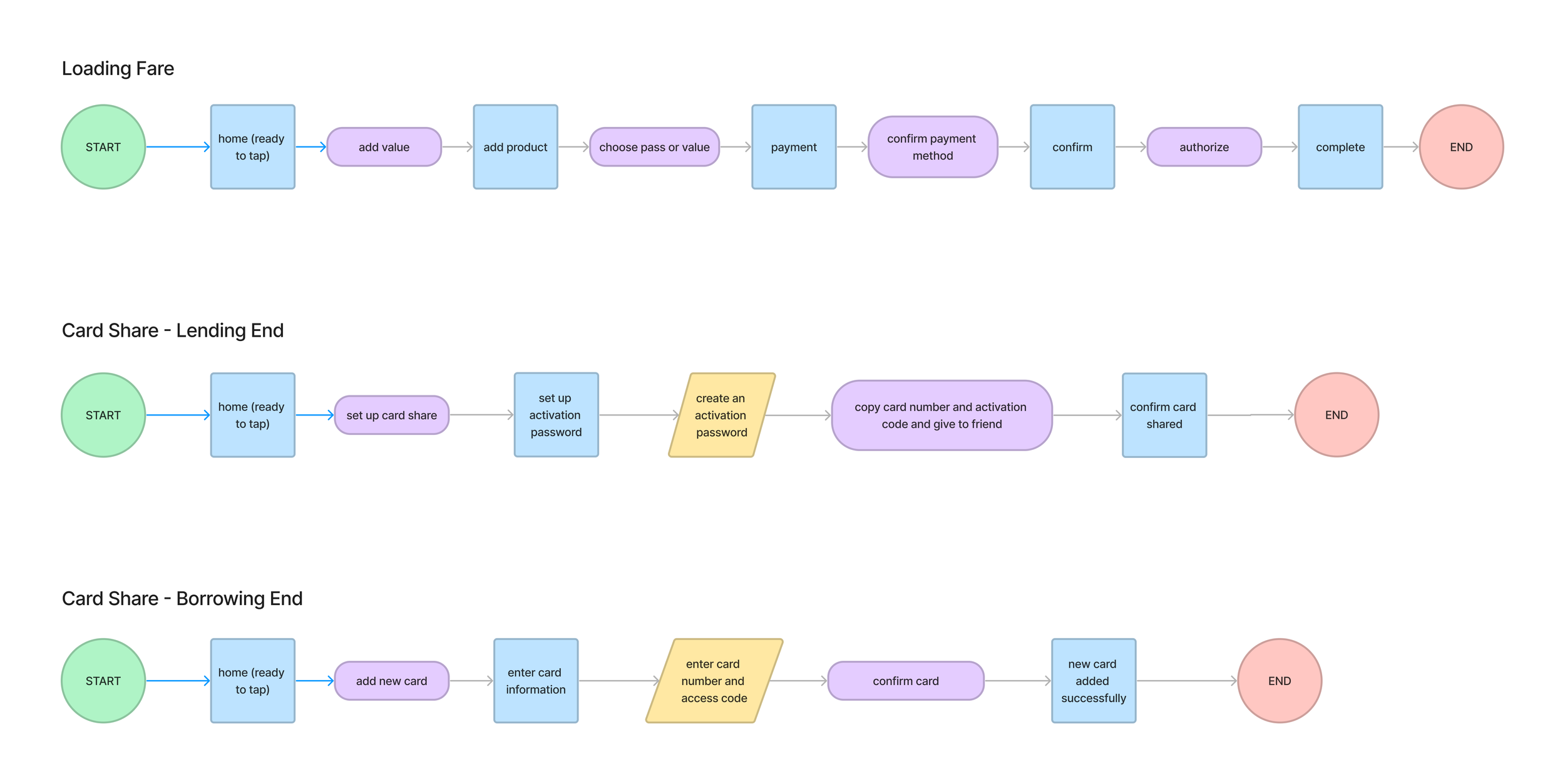
I tried to embrace the “test fast, fail often” strategy throughout this project. Developing an understanding of user pain points is a process with no definitive end so after some brief online research, I promptly jumped into lo-fi sketches of the app homescreen to provide something that users could react to, helping reveal underlying needs and behaviours. This early testing provided crucial insights that radically shifted the subsequent design strategy.
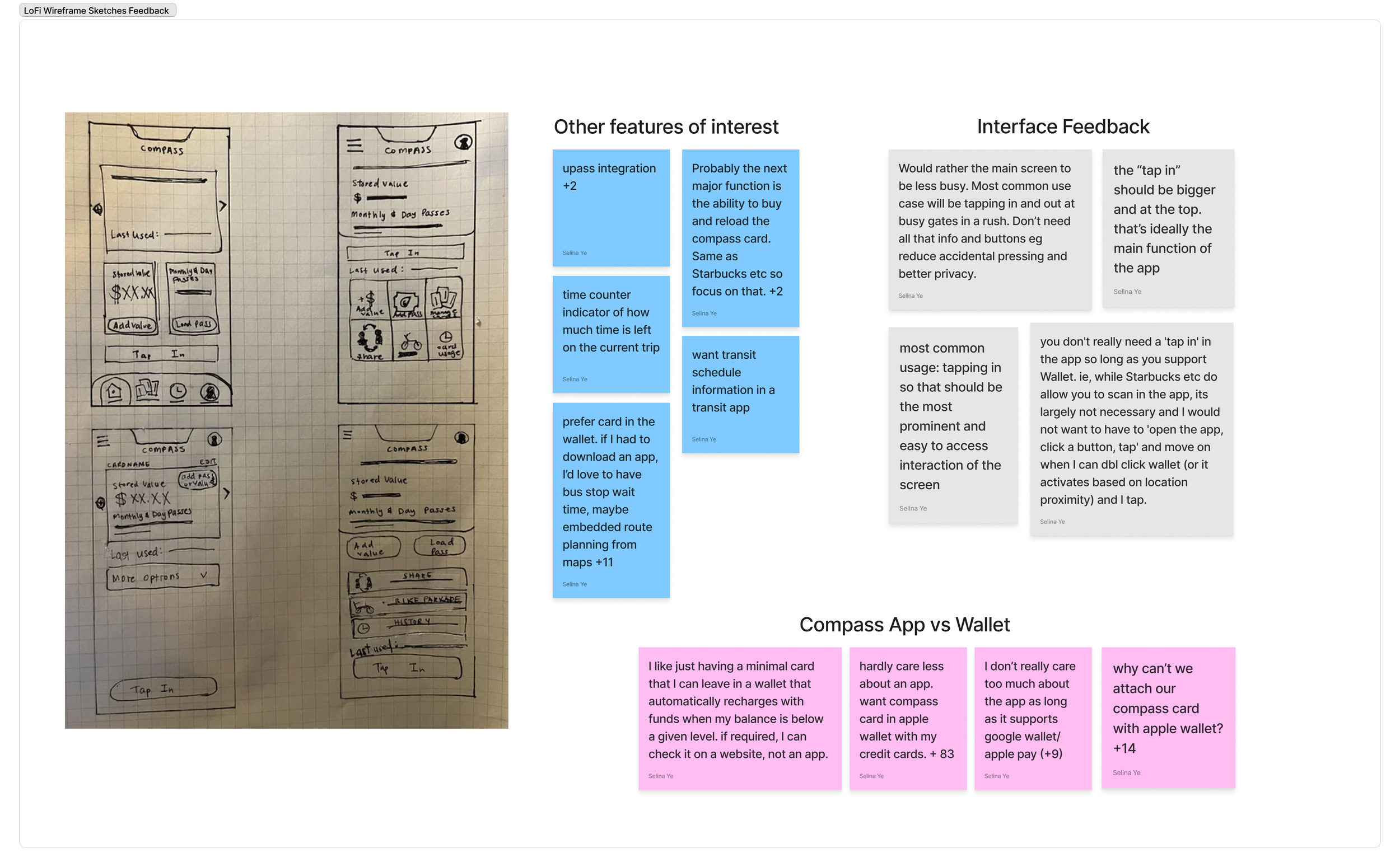
Early lo-fi sketches and summarized feedback.
PIVOT 1: Tap function in the app is unnecessary.
While I initially intended the app to carry the built-in tap function, it became apparent that this was too many steps for the user. They wanted the tap in feature to be readily accessible from their wallet which could be activated from their lockscreen.
PIVOT 2: Apple wallet integration or nothing at all.
It became quickly obvious that users couldn’t care less about a mobile app if there was no wallet feature for hassle-free payment at the gates. In fact, a large number of respondents said they wouldn’t check the app as long as they had the Compass Card in their digital wallet and would refer to the existing website instead to manage their funds. A new design challenge emerged from these findings: how might we provide unique value in this product that can go beyond the existing features of the Compass Card web experience?
A/B TESTING
Taking in the feedback from the lo-fi sketches, I made mid-fi wireframes of the home, card share, and tap in screens then polled users on instagram.
3. Evaluate Usability
After completing the initial prototype, I invited 5 friends who use TransLink to provide feedback in a moderated usability test on Maze. Observing users as they completed the tasks helped me to identify challenges immediately and ask follow up questions.
I used these usability testing and interviews as a way to invite end users into the actual design process by adhoc workshopping potential solutions to their pain points which provided preliminary validation of design iterations. This collaboration was very valuable for an independent ux design project where I couldn’t rely on other team members for regular design critique.
SELECT DESIGN CHALLENGES & SOLUTIONS
4. Solution Overview
DIGITAL WALLET TAP IN FLOW + LOCK SCREEN NAVIGATION SUPPORT
MANAGE FARES AND VALUE PASSES
U-PASS INTEGRATION
CARD SHARE FEATURE
USABILITY OUTCOMES
Design iterations led to a 35% increase in usability test score in Maze, here were some of the specific measures.
Reduced misclick rate by 20.8% when loading U-Pass and reduced task time by 41%
Reduced task time for adding a new shared card by 65%
Reduced task time for sharing compass card by 69%
TAKEAWAYS
-
This was advice from another product designer I received during the early rounds of a/b testing. With no existing frame of reference for this app, the earlier I could validate ideas, the better.
-
User interviews during prototype testing helped elucidate the nuances of language that could either aid or hinder understandibility of the product. A small change in UX copy on a button can be the difference between task completion or getting lost.
-
Hearing users narrate their thoughts as they completed tasks helped me understand the organization of their mental framework and in turn, design experiences in congruence with their conceptual models.
-
Narrowing down an MVP and designing in the face of business and engineering constraints is a necessary practice to create products in the real world. Though my experience was only through the lens of this personal case study, I knew that in order to implement my designs, I would have to first negotiate these factors.
FUTURE WORK
If time permitted, I would:
further refine the UI through heuristic evaluation
explore route planning functionality in the app
design onboarding experience for visiting tourist use case


