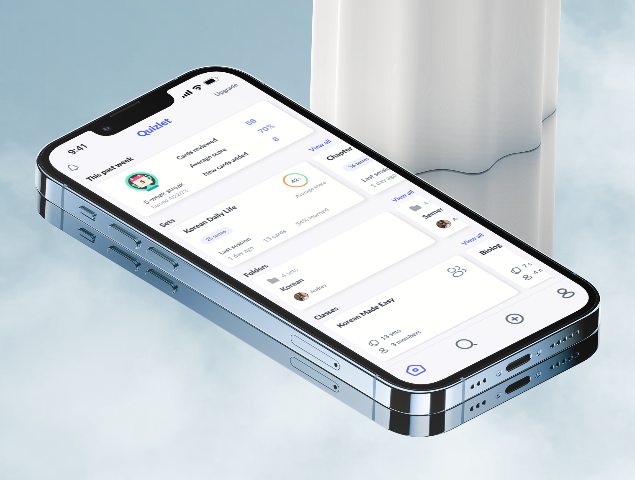
Quizlet
Reimagining Quizlet’s mobile experience for greater user personalization and study flexibility.

Type:
Independent UX Case Study
Timeline:
Sept 2022 - Jan 2023
Scope:
User research
Journey mapping
Wireframing
Prototyping
Tools:
Figma
Photoshop

A few key screens of the final design solution
Overview:
In 2022, I moved to Korea for a year and needed an effective way to expand my Korean vocabulary and stay consistent with my studying but quickly encountered many pain points within the Quizlet mobile experience. This initial friction I experienced as a user transformed into a full-fledged exploration of common user problems and designing a solution for most impact.
The results were the following new features:
Performance analytics integration onto home dashboard
Custom study mode
Memos in flashcard mode
Flashcard mode exit redesign

Schematic of the design process
1. Problem Discovery
I used a combination of competitive analysis, user surveys, and my own personal user experience to generate insights on the pain points of the Quizlet mobile experience.
After taking some time to thoroughly test the mobile app for my own studying needs, I found 3 main frustrations.
-
Contextual notes such as grammar explanations or sample sentences clutter the ‘definition’ side of the flashcard and interferes with the multiple choice format of the learn mode, giving away the correct answer at first glance.
-
The only way to study multiple sets at a time was to organize all the sets into one folder. There was no function to allow dynamic regrouping of the sets or filtering of specific cards for more focused review.
-
I can’t receive intermittent feedback on my performance if I choose to take a break in the middle of studying a large set of cards. The summary only appears after the user has sorted through the entire set which can be very time consuming and discouraging for users who prefer to study in smaller chunks across the day.
While I felt strongly about these pain points, it was important to conduct a thorough exploration of the problem, validate it amongst other users, and assess the bigger picture of where Quizlet stands amongst its market competitors to optimize the impact of this redesign strategy.
Market Analysis
Quizlet’s main strengths that separate it from other digital flashcards was its emphasis on an easily searchable database of free user generated sets and a strong mobile experience.
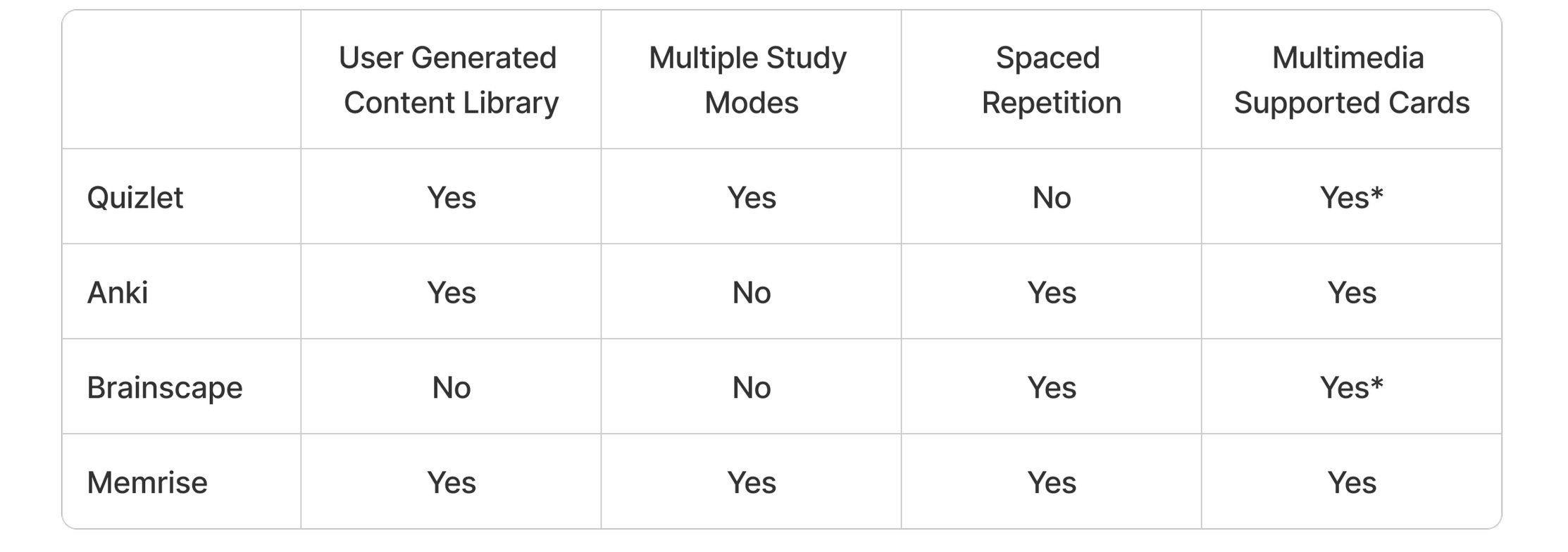
* limited functionality for free users
Across many online reviews, the discontinuation of spaced repetition and paid access to the multimedia creation toolkit was a major disappointment to users and the reason why they ultimately chose some of the competitors over Quizlet.
Seeing that Quizlet had historically offered but eventually phased out spaced repetition, it seems that their product vision and development strategy lies in a different direction. I ruled out enhancing the multimedia creation toolkit feature since it is a paid function and therefore wouldn’t benefit all Quizlet users.
I felt that there were other potential design solutions which could better differentiate Quizlet from competing products and add greater value to the overall user experience. To clarify the design direction, I surveyed real world users.
User Research
I implemented a qualitative survey to understand which features users prioritize in a flashcard software, why they favour one competitor over another, and the challenges they experienced with Quizlet. I consolidated their feedback along with my own brainstorm into a like/wish/wonder table to identify common themes.
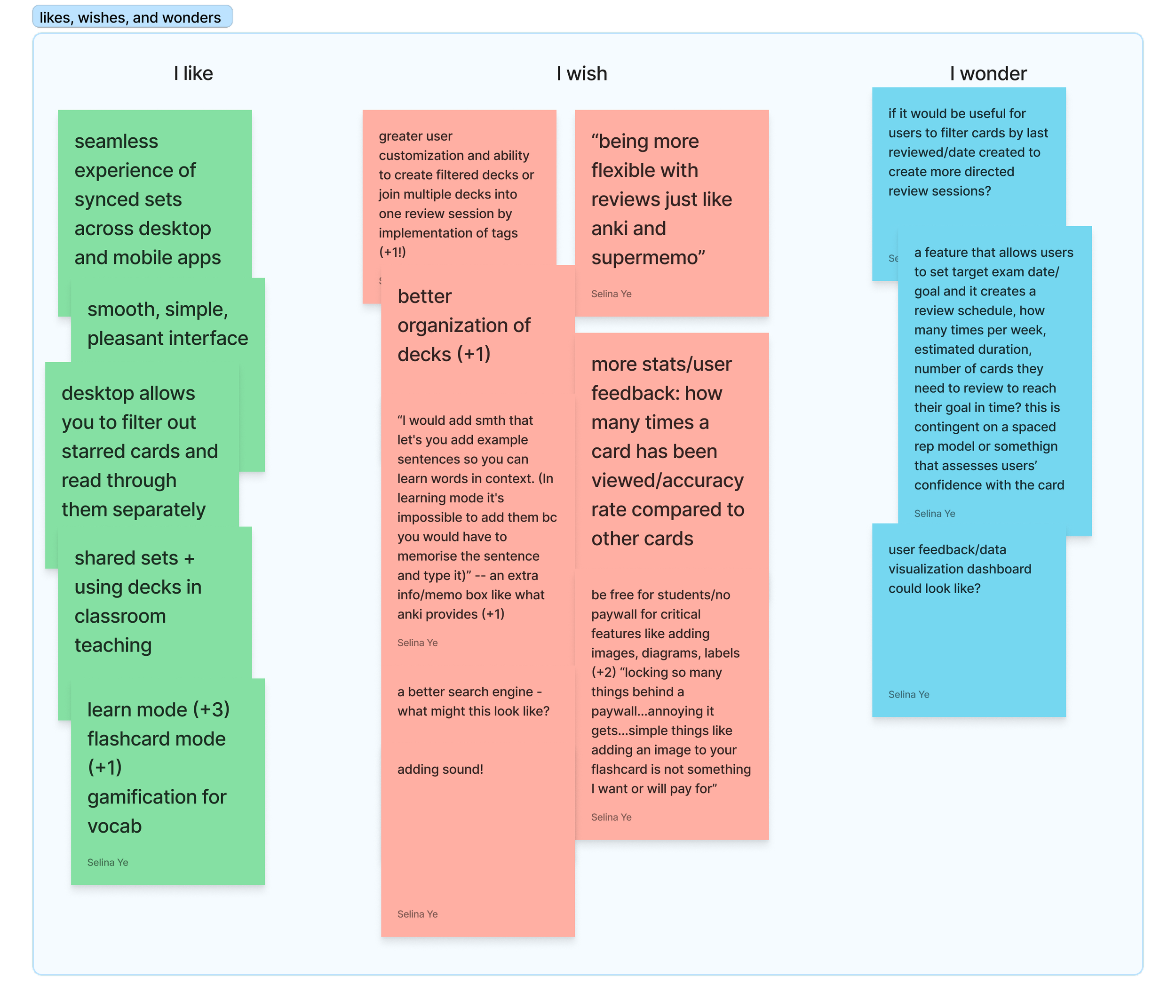
There were 3 main takeaways from the survey:
1. Users value flexibility above all else, the main area Quizlet falls short
50% of surveyed users mentioned customizability of their cards as one of the most important features in a flashcard application. One user said that
“Quizlet is not flexible enough and sounds too much like cramming”
while another noted that
“Functionality (was) overly limited on the mobile apps. (There is) not enough customization for people with differing memory capacity.”
2. 78% of current Quizlet users were either ‘somewhat’ or ‘very likely’ to use card tags to filter their sets when studying
In lieu of a spaced repetition algorithm that allows users to focus their studying on high yield terms they have been struggling to learn, I proposed an alternative feature seen in the leading competitor Anki which allows users to optionally tag each card with keywords that they can subsequently use as a filter, creating custom sets to study target areas.
This circumvents the problem in the current design where users are forced to study all terms in a folder or set at once which can be overwhelming and disorganized.
3. Custom feedback on user progress can make or break the overall experience
“Since Quizlet made the learning mode paid, I’m only using Anki.”
The learning mode was once a free feature which provides users an adaptive study plan based on the user’s target learning date and machine learning data drawn from other users’ study sessions.
With neither spaced repetition or adaptive study plans available to free users, Quizlet struggles to provide enough incentive for new or existing users to continue using the product when Anki and Brainscape both implement user-responsive flashcard algorithms.
The question then arises: how can we respect the business choice that Quizlet has made to keep their learning mode a paid feature, while still retaining current Quizlet users who value feedback on their progress? In this case, what study performance metrics are relevant to a user?
2. Defining the objective
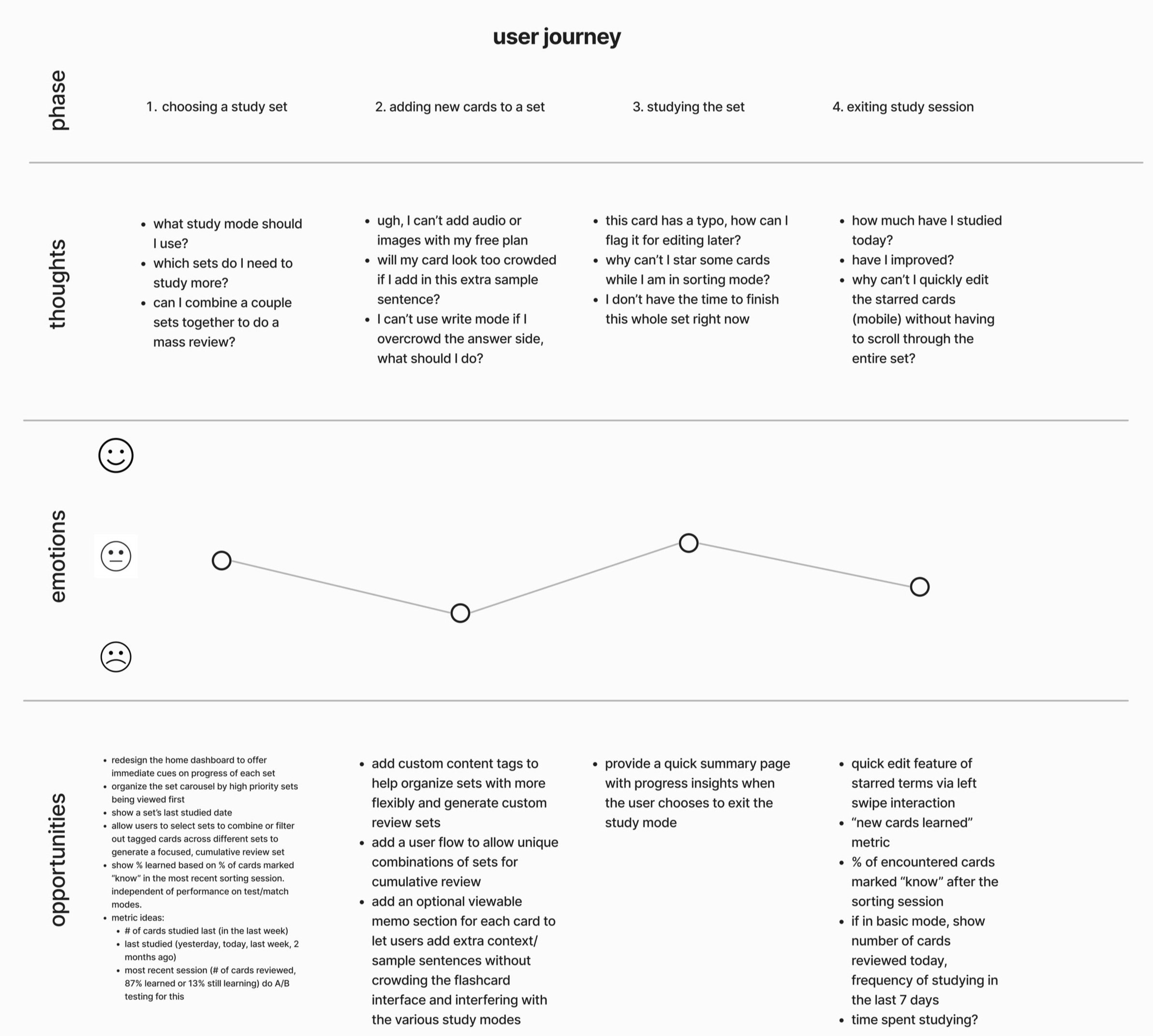
Using findings from the initial generative research, I proceeded to map out the user journey to identify which stage the users’ pain points manifest and brainstorm potential opportunities for design intervention.
Framing the approach
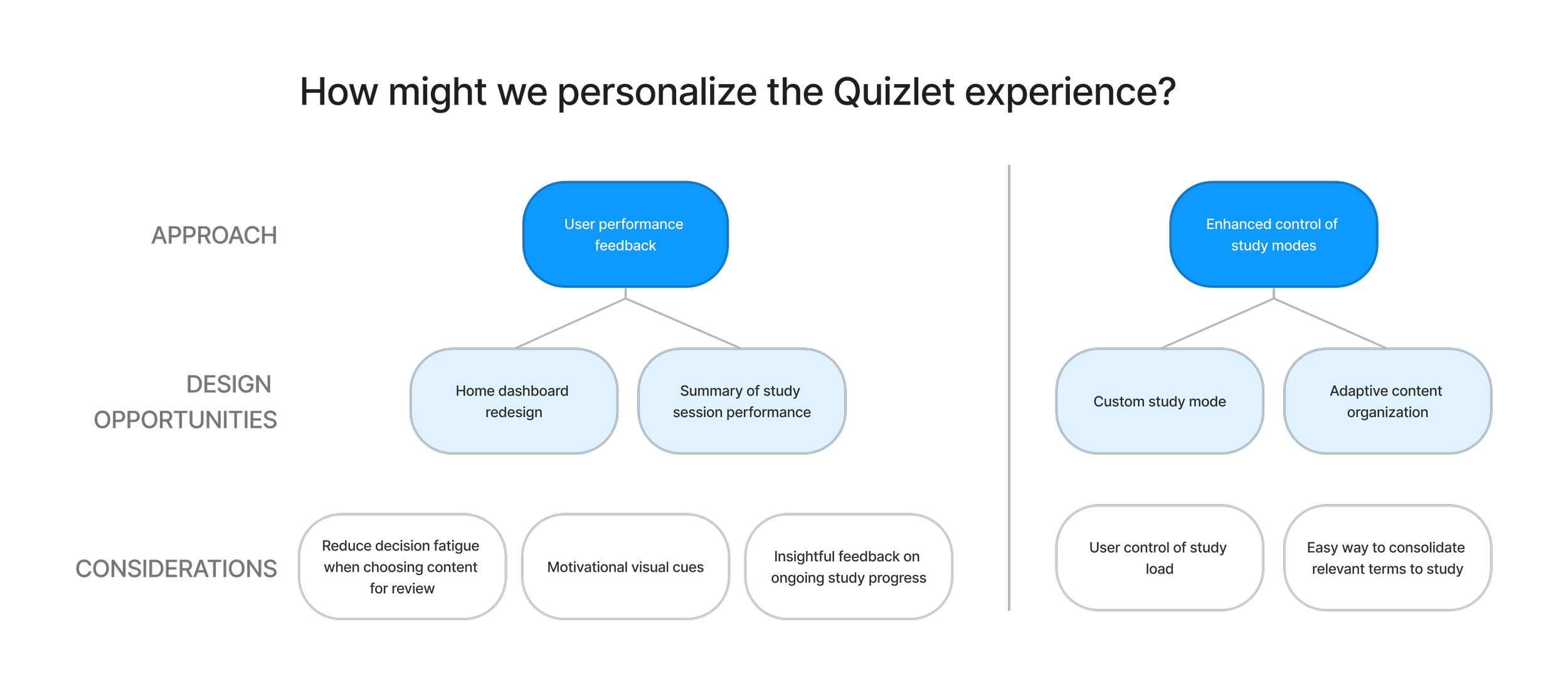
Based on visualization of the user journey, I distilled the overarching objective of this project into the following problem statement:
How might we personalize the Quizlet experience to give users more control over their studying to meet their unique learning goals and needs?
My strategy was to explore a user-centric design solution in response to the feedback which consistently raised a need for more flexible studying and progress tracking. I broke the problem down into two main design directions grounded in creating a personal Quizlet experience for users.
3. Ideate
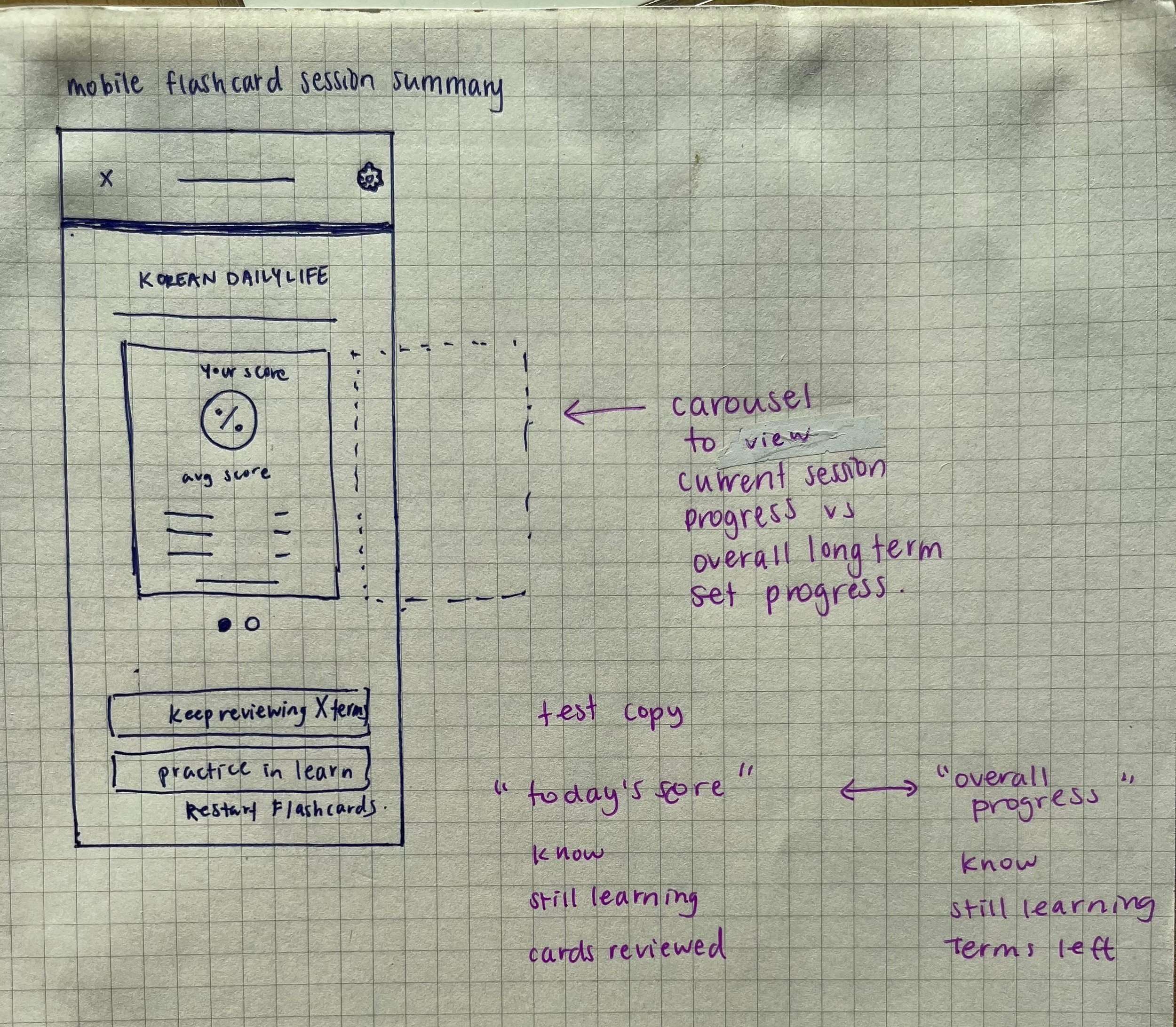
I began with hand sketches of key interfaces and user flows which eventually became the foundation for the low-fidelity wireframes.
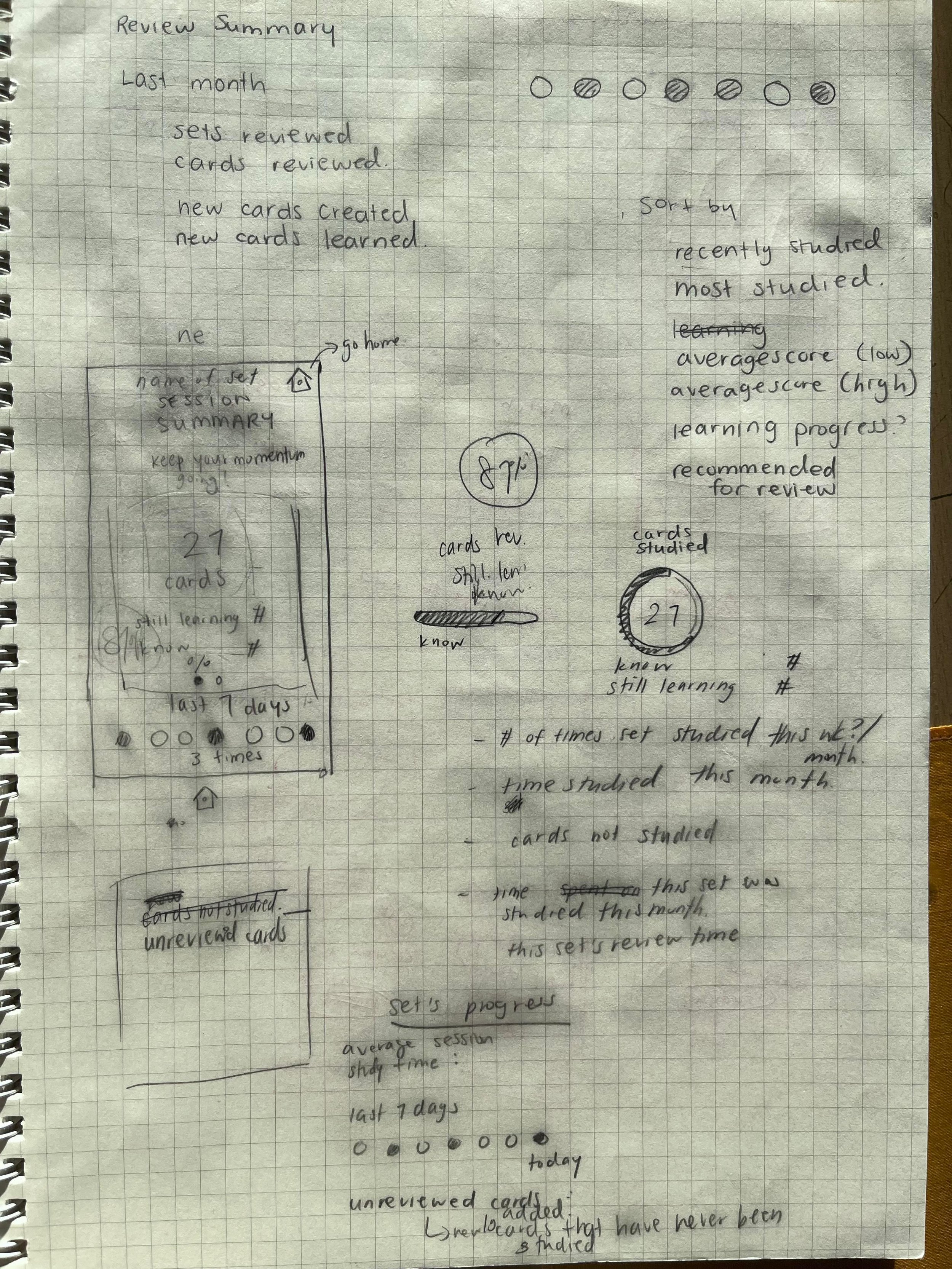
A few of the initial interface design sketches

HOMEPAGE
Surveyed users were unsatisfied by the lack of personal studying feedback. I designed the home dashboard to prioritize performance analytics that would be both intuitive and simplify the process of deciding which content needs review soon.
Motivation at the front and centre
The achievement banner at the top provides an easily visible reminder of user’s recent studying to reinforce their habit.
Progress benchmarking
Each set’s ‘average score’ gives a metric of the user’s familiarity with the terms and can be quickly compared to their most recent review score (% learned) to track learning over time.
Pick up where you left off
Time elapsed since last review session is indicated and sets are sorted based on what was most recently reviewed to help users seamlessly resume studying or identify content that is due for a memory refresh.
SESSION SUMMARIES
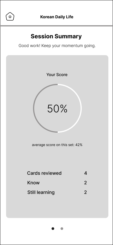
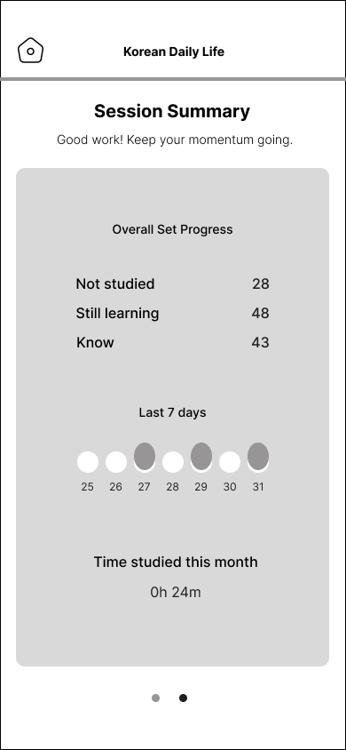
My preliminary research had indicated a need for enhanced learning feedback in the Quizlet experience. One of the major frustrations was how users were unable to receive performance feedback unless they swiped through their entire set of terms. I found the lack of intermittent study tracking discouraging for sets with more than 20 cards. For many users who study in small chunks throughout the day, implementing a session summary screen when they exit flashcard mode provides reinforcement of users’ study habits, no matter how long or short their sessions are.
A/B Testing: Color UI Feedback
My initial design of the home dashboard and session summary page was monochromatic as it appeared easier on the users’ eyes, but upon comparison with the existing color design, I decided to create an alternate version that utilized Quizlet’s signature interface colors for consistency. I then conducted an A/B test between the two color options on social media.

Option 1: Monochromatic
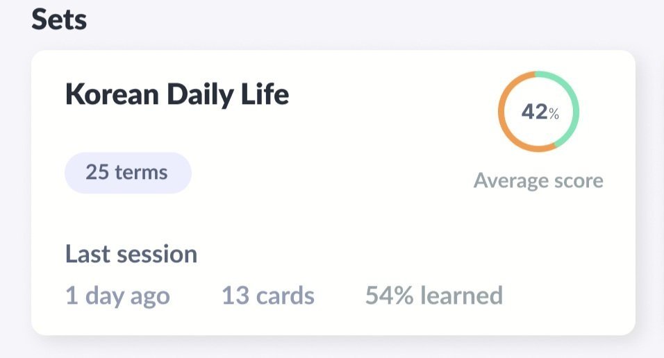
(FINAL CHOICE) Option 2: Contrasting colors
More people favored option 2, with one user commenting that it gave them more studying motivation to turn the orange into green and others saying they also preferred staying consistent with Quizlet’s familiar color system.
NEW: MEMOS
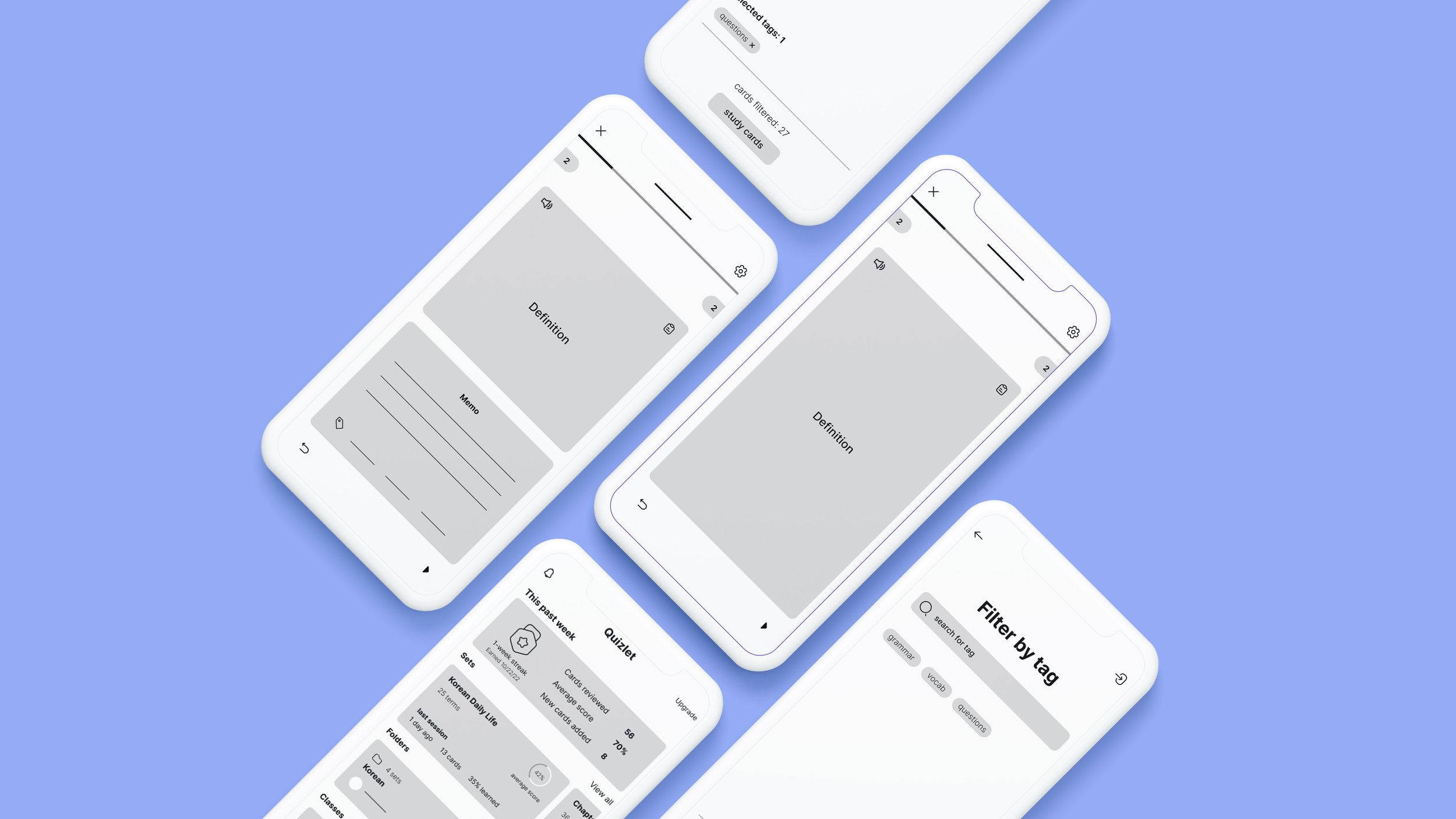
10 out of 14 users surveyed mentioned using flashcards to help them study a language or expand their vocabulary. This new memo feature resolves an existing pain point where information like grammar explanations and sample sentences overclutter the ‘definition’ side of the flashcard and interfere with the use of Quizlet’s test, match, and learn modes which typically autogenerates options based on the user input on the ‘definition’ side.
The memo section allows users to hide away relevant contextual notes and only refer to them when needed.
NEW: CUSTOM REVIEW
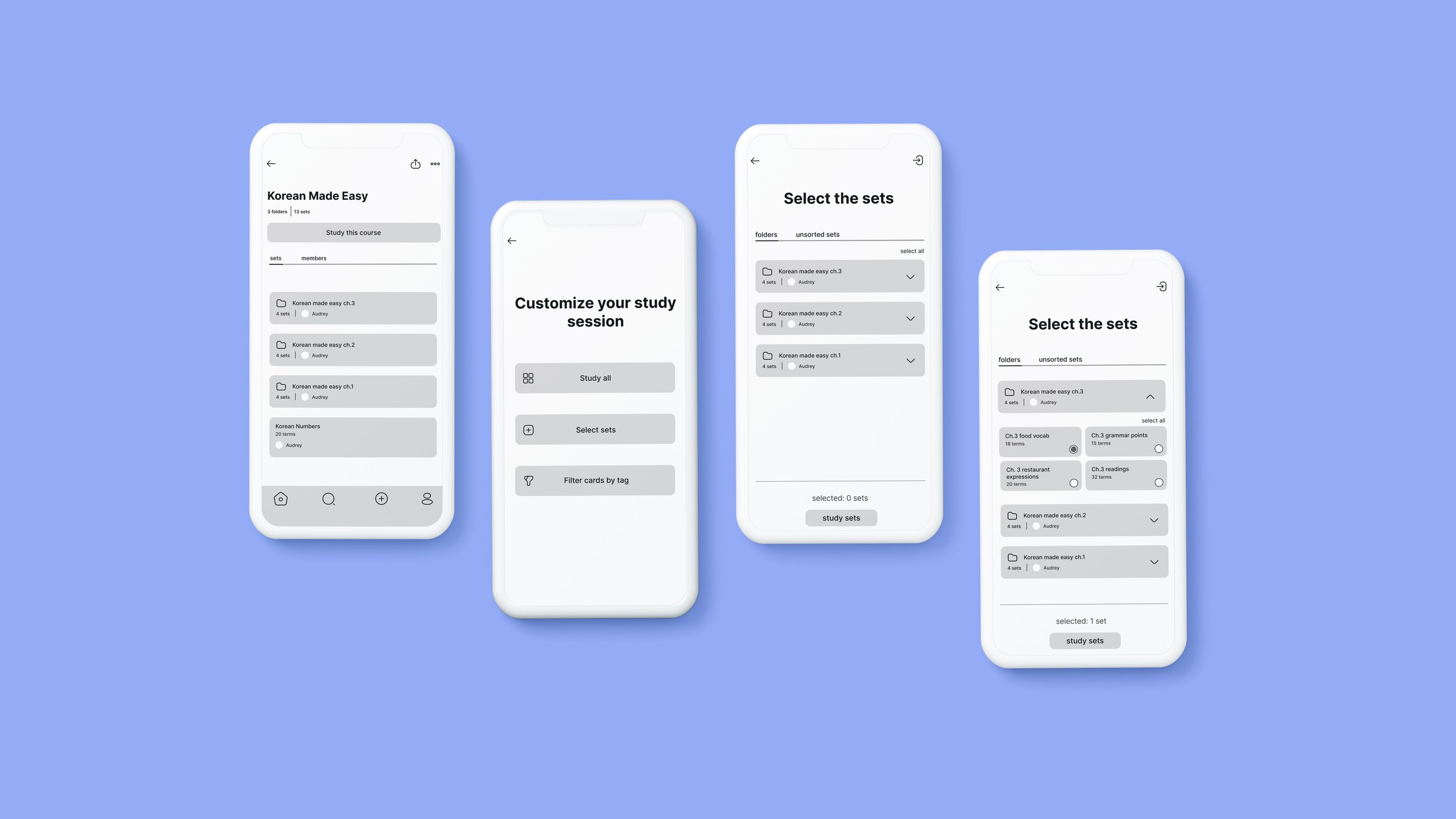
Previously, users had limited control over the focus and volume of content being reviewed. The custom review session feature gives users greater control over both those parameters.
BEFORE: reviewing multiple sets at once
AFTER: custom study mode
NEW: FILTER BY TAG
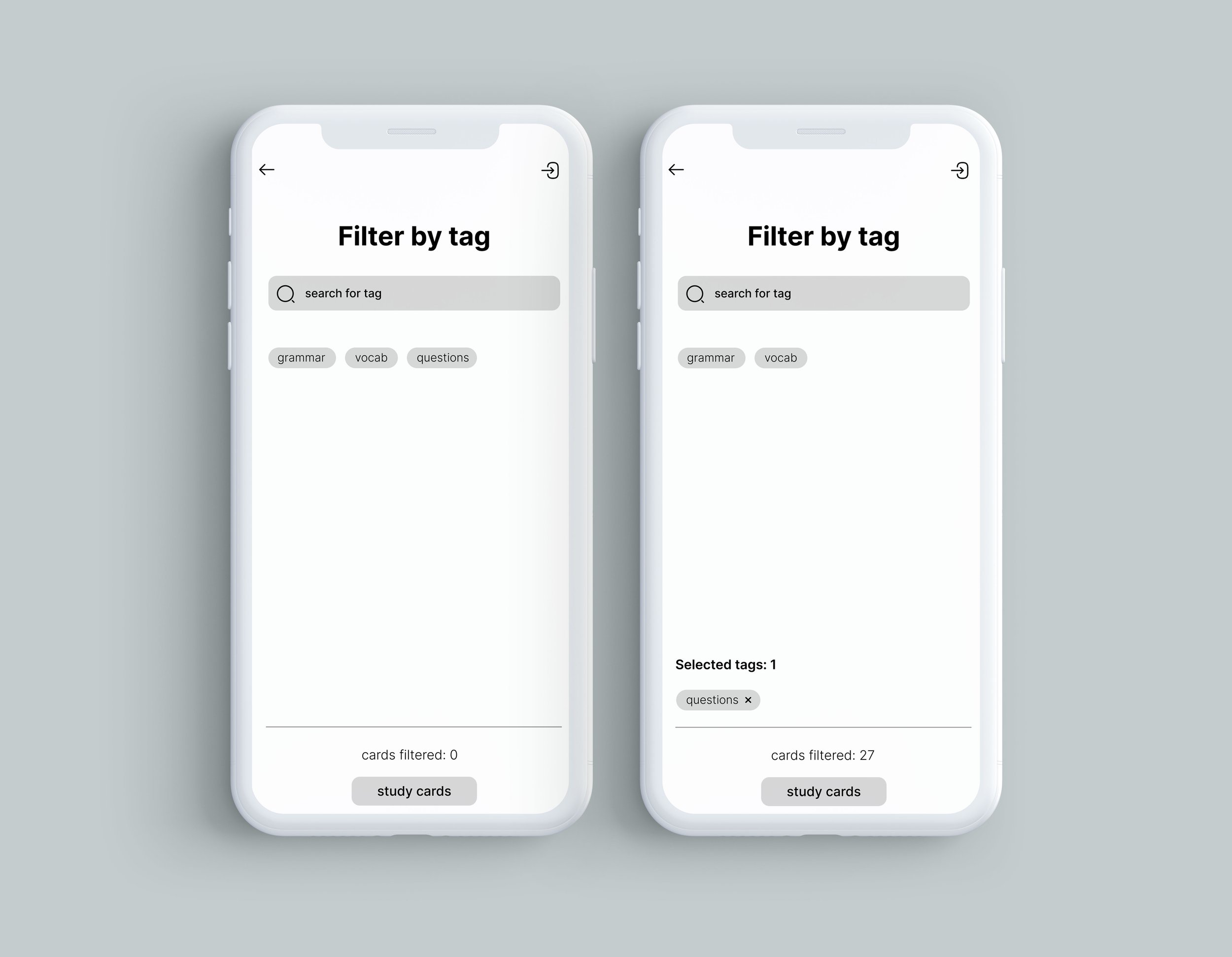
Organization of decks was a frequently mentioned problem for current users. This feature allows users to dynamically reorganize their library with custom content tags so they can have enhanced control of what they want to review. Users can quickly filter for high yield content to review during the few minutes of spare time in their day or break down their ongoing cumulative review into manageable, subtopic-based steps.
FEEDBACK & RESOLUTIONS
I implemented an asynchronous survey and received feedback from 2 users on my low-fidelity prototype who both positively responded to the new features. I would have preferred user interviews to ask more granular questions about design and function, but was unable to schedule them due to timezone differences. Looking back, I would have wanted to dig deeper for design critique.
Despite the lack of direct feedback I received for my prototype, I found myself actively revisiting the Quizlet mobile app while designing the final high fidelity prototype, making notes of design updates that had been implemented since I initially started this project, critically assessing each new iteration to deduce the reasoning and refining my own prototype through those observations.
This stage of the project involved bridging my own ideas with what I assumed to be more rigorously tested design decisions that the in-house team at Quizlet was simultaneously making.
Reduce study friction
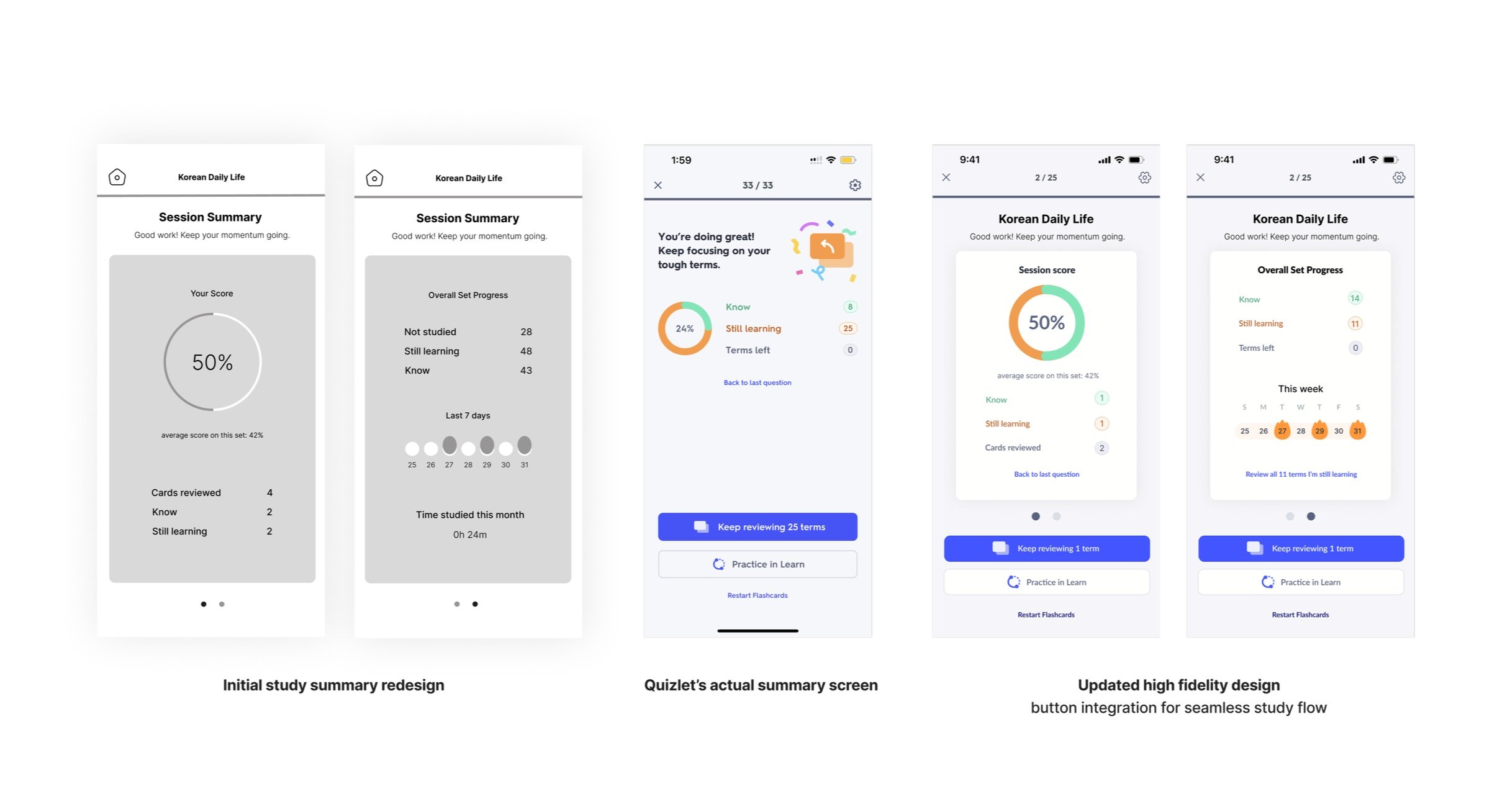
Upon review of this lofi design with the existing features on Quizlet, I updated my final prototype to integrate buttons that allow users to quickly hone in on terms they are struggling with, turning intention into effortless action. Users can choose to quickly review the “Still Learning” terms from the subset of cards they just viewed or from the entire set.
This flexibility accommodates users with different preferences for how frequent they review their challenging terms.
Instant cues
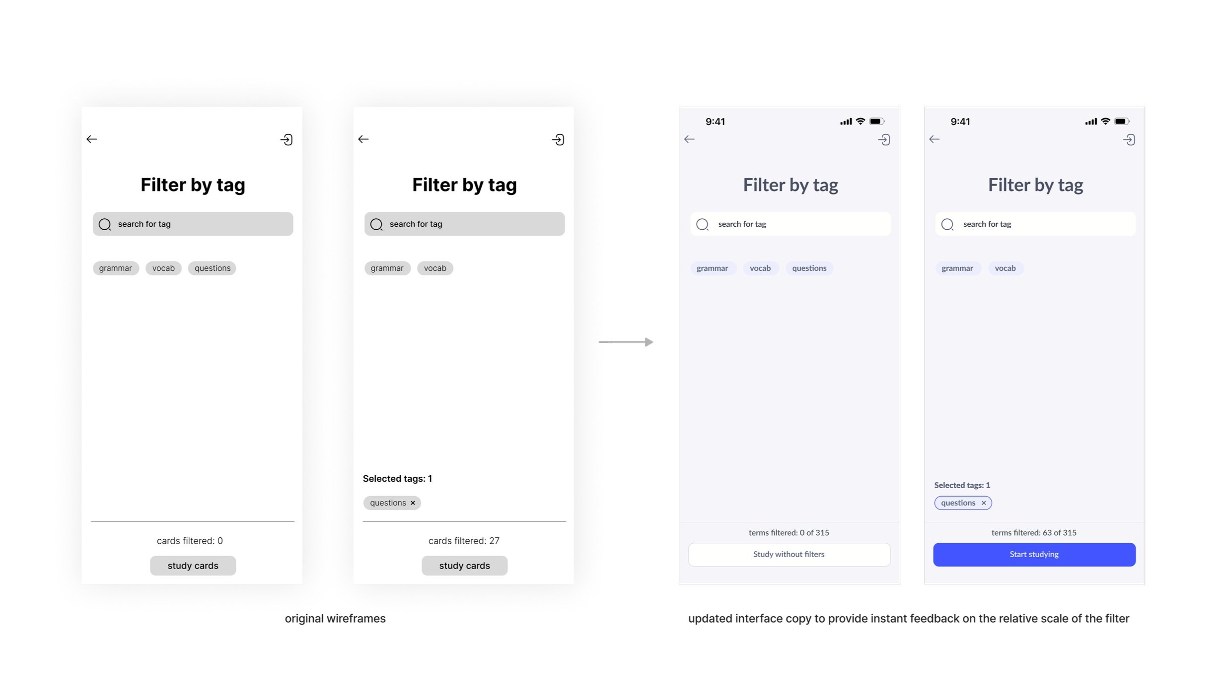
In scenarios where users are trying to study in preparation for an exam and need to master all the terms by a set date, feedback on the scale of the filter (is it too broad or narrow?) becomes a relevant consideration to ensure they are making adequate progress towards their study goal.
A small tweak in the copy of the interface can give users quick information on whether they should refine or broaden their filter settings.
4. Final Design
TAKEAWAYS:
Forget personal biases and needs, let the data speak for itself.
While the initial catalyst for this project came from a desire to introduce a quick edit feature in the flashcard mode to fix my constant Korean typos, I soon realized after some user research that this wasn’t the biggest priority amongst most users. If the initial problem discovery is not thoughtfully done, you can waste a lot of manpower and resources building a prototype that does not translate well in the real world.
Handling limitations as a team of 1.
Research can go on indefinitely. We can’t know every answer and the desire to ask more questions is always going to persist, but due to time and resource constraints, I had to know when to stop. It is a fine balance of getting sufficient data to make reasonably well-informed decisions while also sticking to a timeline and gathering just the minimum required insights to produce meaningful design solutions. There’s only so many problems you can adequately address within the course of one project so I had to reflect and prioritize which were the high yield areas to target.
Design is an iterative process with no final end.
Throughout this project, I was often restless about my design choices and tempted to scrap the work and restart, thinking it would eventually lead to the ‘perfect’ design. In retrospect, I learned that the goal of each design is not to provide a definitive final solution, but rather to refine and adapt products to changing demands. The purpose of experience design is to constantly reflect on itself. There is always room for better.
Next time, I would like to explore more solution alternatives instead of prematurely settling on one prototype direction. I later found it difficult to draw out the critique and discussion I needed to refine my design because I didn’t present clear prototype variants or have an opportunity to interview my users directly. I think this project could have benefited from more systematic usability testing.
